My project at Insight was ultimately came down to binary classification problem, predicting the chance of fire on a block-by-block resolution in San Francisco. For each block, I had a collection
of features about the characteristics if the buildings within it, land values, crime and past fire report information. Given these features for one year, my model's task was the predict the
change of fire in that block in the following year.
To assess the performance of such a model, we need to understand classification metrics! These are just a subset of model performance metrics in general, which I will hopefully cover more of in a
future post. Classification metrics for machine learning models is a very well covered topic in the blogging space, and this post leans heavily on what I’ve learning from reading just a few of
the many excellent online resources about this subject.
It’s fundamentally important to be able to measure how well
a model is performing at the task its been assigned. This process is called validation and it is needed so that a model can be changed or improved if it is not performing to a satisfactory
standard. A validation metric is a scoring system used for this. To be useful a metric must
-
Be easy to interpret and communicate
-
Be easy to compare across models and model runs
-
Preferably be a single number, to help with the above
needs
There are many established metrics, each of which can be
appropriate in some situations but not others.
Classification
tasks
Metrics are arguably most diverse and complicated in the
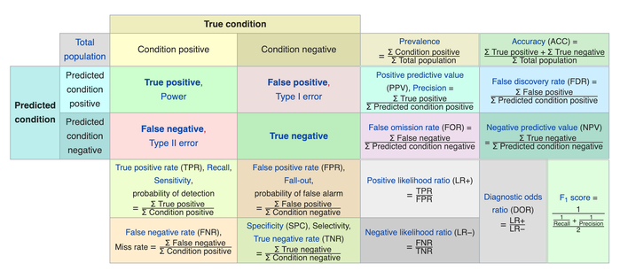
case of classification tasks. When scoring a classifier we compare the model predictions from a test set to the actual, ground truth results. Lets start with some definitions
-
True positive: The model correctly predicts the class of
this example
-
False positive: The model predicts a negative result
when the result should be positive (type 1 error)
-
True negative: The model correctly predicts that this
example is not in this class
-
False negative: The model predicts a positive result for
this class when the result should be negative (type 2 error)
This chart from Wikipedia shows all the metrics that can be
created using combinations of the above four definitions. There are so many! We will dissect some of the components in an attempt to understand them.
The general idea is to come up with a metric - preferably a
single number - that can summarize the model performance with reference to the four definitions above.
Exactly which one should be used depends heavily on the
dataset and the questions being asked: In a cancer detection model, for example, the cost of a false negative (i.e. cancer is present but not detected) might be much higher than the cost
of a false positive.
The most intuitive summary metric is the accuracy, which is
defined as follows
accuracy = (true
positives + true negatives) / total examples
Accuracy is a good metric if the classes are balanced
(e.g. there are roughly equal numbers of examples in each class) and the
cost of the false positives and false negatives are roughly equal. If this is not the case the accuracy can be a misleading metric. Take for example a severely imbalanced classification problem
where we have 1000 negative examples and 10 positives.
A completely ignorant classifier that labels all the
examples as negative will achieve an accuracy score of
accuracy = (1000 + 0)/1010 = 99%
This high score is deceptive because the model is useless at
detecting positive results!
To cope with this problem, we can choose to penalize false
positives or false negatives. This will generate two alternative metrics
precision = true positives / (true positives + false positives)
Thus, if a model misclassifies many negatives as positives,
its precision will be hampered. A low precision does not necessarily mean bad performance if the cost of false positives is low. A second metric, which instead penalizes false negatives, is as
follows
recall = true
positives / (true positives + false negatives)
If the model misclassifies many positives as
negatives (meaning that it misses many positive results), then recall will be low. In the
case of my fire mode, for example, this amounts to not flagging blocks as destined for fire when they actually do end up experiencing fire.
Note that both precision and recall have their limitations
and can also ‘break’ in certain cases , just like accuracy.
Say for example that a model just classified everything as
positive - it would have perfect recall, but it would not be useful.
Similarly, a model that only correctly classifies one out of
many positive examples but does not misclassify any negative examples will have perfect precision but will also not be useful.
Furthermore, recall that a single metric is most useful for
classification tasks so that model performance can be reasonably compared. Accuracy and precision can be combined into a metric called F1 score, which is written as follows
f1 score
= 2*precison*recall/(precision +
recall)
This can be useful, but note that that assumes that
precision and recall should be equally weighted and this might not be a good interpretation in certain situations.
A further issue is that all of the aforementioned metric
require a threshold, which is a level of certainty above which the model will classify a positive element.
This is clearest in the binary classification example. If we
predict the probability that an example is true, we are free to choose a probability threshold above which the model will flag that example as true. Examples associated with a lower probability
score will be flagged as false. The most obvious choice of threshold is 0.5, but that might not always be appropriate. What we really need is a way of understanding performance across a range of
thesholds.
Precision-Recall (PR)
curves
Thankfully, we can understand the effect of choosing
different thesholds by plotting precision vs recall as a function of theshold. This creates a precision-recall (PR) curve, which might look a bit like the following (from this stackoverflow post).
Typically recall is plotted on the x axis and precision on
the y axis. As one moves along the x axis from left to right, the threshold value for which the precision and recall are calculated decreases from 1 to 0. At a threshold of 1 (or very close to 1), precision is high because the number of false
positives is small.
However the recall is low because many of the positives are
misclassified as negatives. At the other end of the scale, the model is flagging everything as positive and so its recall is 100%. In a balanced classification problem the precision is 50%, as
seen on the graph.
This is great because it allows us to understand the
performance of the model across the full range of thresholds but it does not provide a single, easy-to-interpret number that summarizes model performance, which is what we ultimately
seek.
ROC curves and the
AUC
Just when we thought this whole
classification metrics zoo was complex enough, lets throw in two more acronyms! The Receiver Operating Characteristic (ROC) curve is related to the PR curve and actually shows the same data but in
a slightly different way. Its plots true positive rate (also known as sensitivity or recall) against false positive rate
(also known as fallout).
True positive rate: The ratio of the number of true positives at that the model flags at
that threshold to the total number of positives in the test dataset
False positive rate: The ratio of the number of false positives the to the total number
of negatives in the dataset
Again, these are calculated as a function of
threshold.
This allows us to answer questions like
“If we accept that the model will flag 20% of the total number of
true negatives as positive, what proportion of the true positives will it catch?”
If the answer is more than 20%, then the model is
doing better than random chance.
The following example of an ROC curve comes this site, which provides a more in depth description of how these curves are
constructed.
The diagonal line down the center of the ROC curve indicates
the performance of a model that does no better than random chance.
The better the model, the closer the ROC curve becomes to a
box-shaped function. In the best case scenario, a false positive rate of 0 will produce a true positive rate of 100%, meaning that all of the positives are correctly flagged without the model
incorrectly labelling any true negatives.
This leads to the concept of Area Under the
Curve (AUC), which is a single metric measure of model skill. To interpret it, we can
see the ROC curve as describing the tradeoff between making both sorts of error. A skillful model will not have to make many mistakes in before it correctly classifies all the positive examples,
whereas an unskilled model will make many mistakes. The AUC quantifies this skill level. In addition, the distance between the diagonal and the curve at any point can be interpreted as the
probability of the model making an informed decision.
The ROC is informative, but must be treated with caution
where class imbalance is high because the absolute number of false positives may be higher than the curve suggests. The AUC score is insensitive to the absolute number of false positives - only
the proportion of the total.
Thus in general it's useful to plot both the PR curve and
ROC curve and then make interpretations based on both of them. It should be clear from the curves and AUC score in combination which models are performing better than others.
Thats all for now, but no doubt there will be more about ML
metrics in a future post!